
NOVA: Helping English learners practice speaking through real-life scenarios
Client
NOVA
Role
Product UI Designer
Services
UI,Design Direction, Mini Design System
Collaborators
Thuta (UX), Swan (PM), Min (Dev)
Tools
Figma, Ai, Ps
Timeline
2024, 3 months
NOVA is an AI-powered app that gives feedback and targeted suggestions to enhance users’ speaking abilities—making language learning more engaging, practical, and effective.

Choose Chit Chat
(Role Play Scenario)

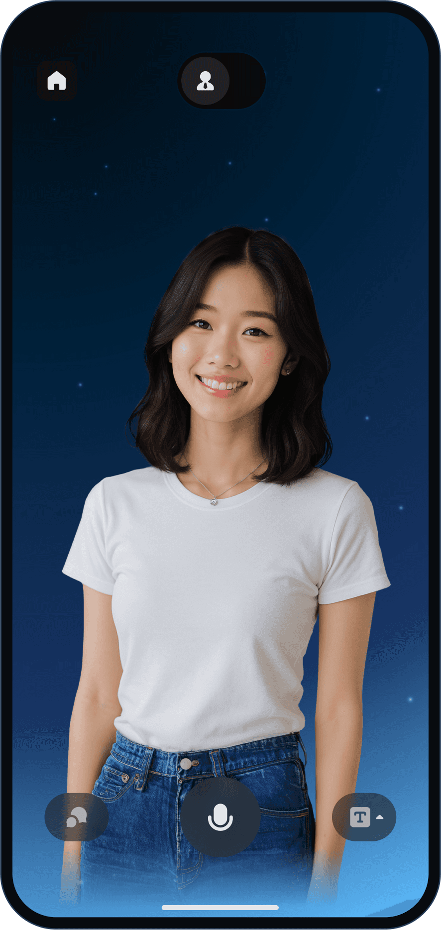
Talk with NOVA
(AI speaking partner)

Get detail feedbacks
after the session
Improve their profile
Translating NOVA’s vibrant brand identity into the digital space
My objective as a UI Designer was to capture its brand essence while ensuring usability, and functionality. Nova’s brand identity is all about brightness, new beginnings, and significant impact. The name suggests that the app can illuminate the path to language mastery and bring a fresh, impactful approach to learning.
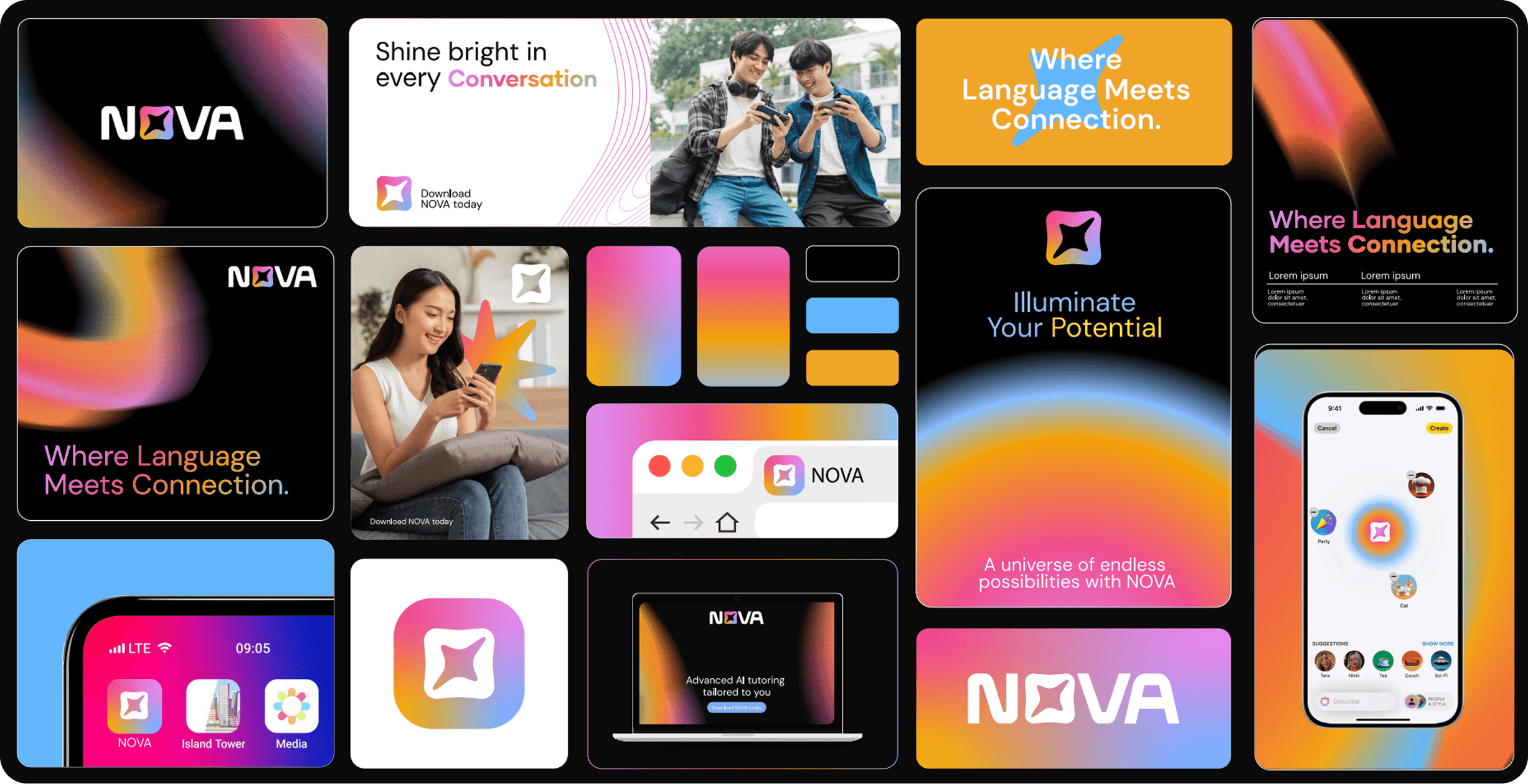
Although NOVA arrived with a beautifully crafted brand identity—designed by my friend Chue—it was primarily intended for commercial use. The digital guidelines were either missing or underdeveloped.
This led to a challenge: how could I adapt this identity so that NOVA maintained a consistent look and feel even on screen?
Defining principles for a cohesive digital identity
To shape how colors, typography, buttons, and cards should visually represent NOVA, a clear set of design principles was established. These principles define the app’s digital identity and serve as a guide to ensure every visual element in the interface feels cohesive and true to the brand.
Spaciousness
We design with openness and clarity to ensure every element is easy to navigate and understand.
Continuity
Interactions are built to feel natural and continuous, guiding users smoothly through their learning journey.

Luminosity
We use light, contrast, and focus to draw attention, energize the interface, and enhance comprehension.
Vibrancy
Color and motion are used with purpose to reflect NOVA’s optimistic spirit and keep the experience engaging.
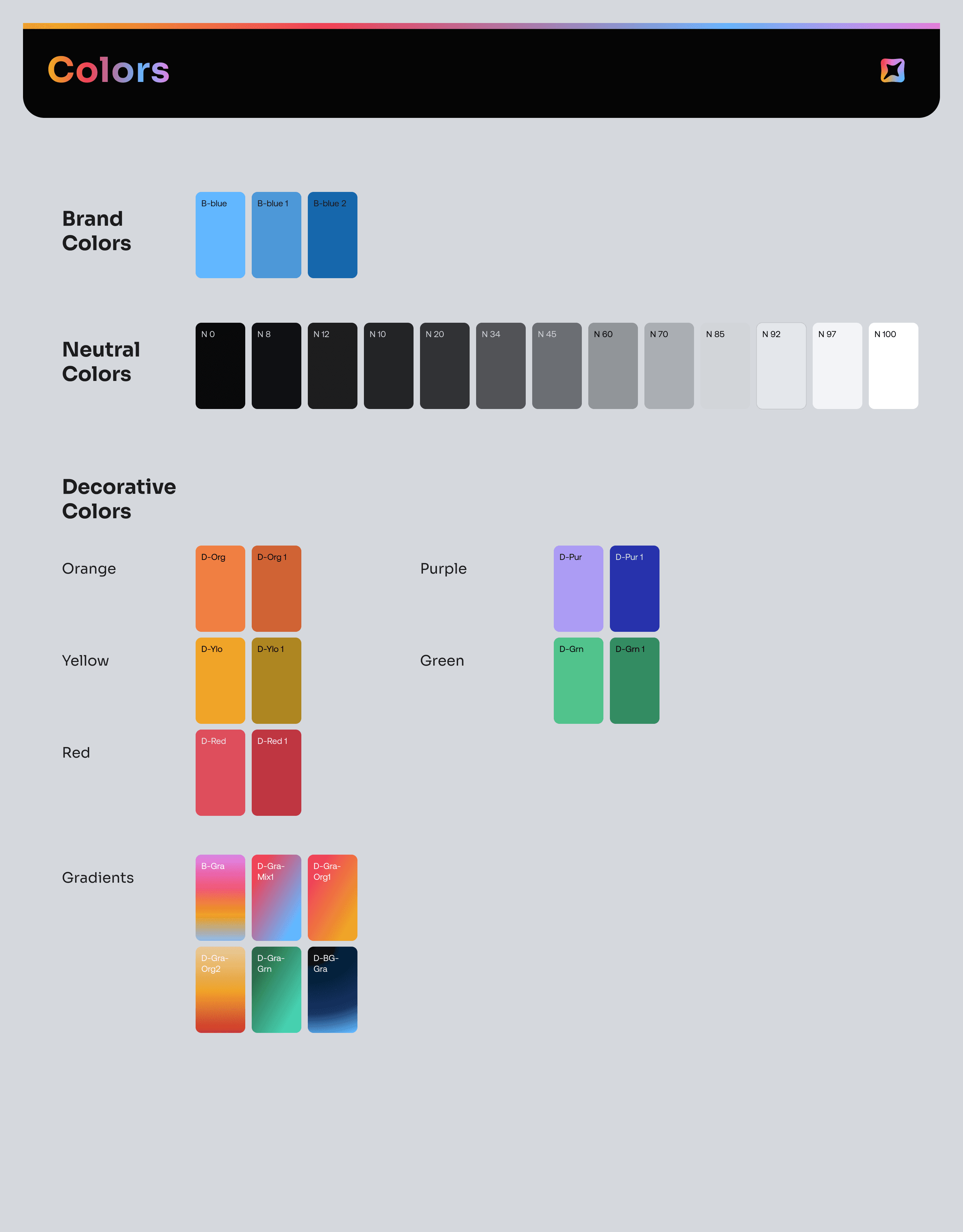
Extended the brand colors to fit the product needs
To address the diverse needs of the interface, the original five core brand colors were expanded into a system of 30. A breakdown of the new color palettes is as follows.
Extended
Utility
palette

The original black and white backgrounds were expanded into 12 tinted tones, forming the foundation for 80% of the interface. A subtle purple hue was added to create visual harmony, with each tone carefully selected to ensure clarity across both light and dark usages.
Initial
Brand
colors
Extended palette for digital use
Primary Brand Color
Palette Decorative Purpose
The primary brand color was initially unclear, so in collaboration with the brand designer, we established bright blue as the primary color—reflecting both the NOVA concept and its connection to the education sector. Two additional darker shades were introduced for interactive use.
Red and green were designated for status indicators such as error and success, while other colors were set as decorative, with one extra darker tone added for interaction.
Newly added Decorative palette

New colors and gradients were introduced for use in different places like NOVA Premium, reward system, speaking experience, and proficiency levels.
The new color palettes are applied as follows.

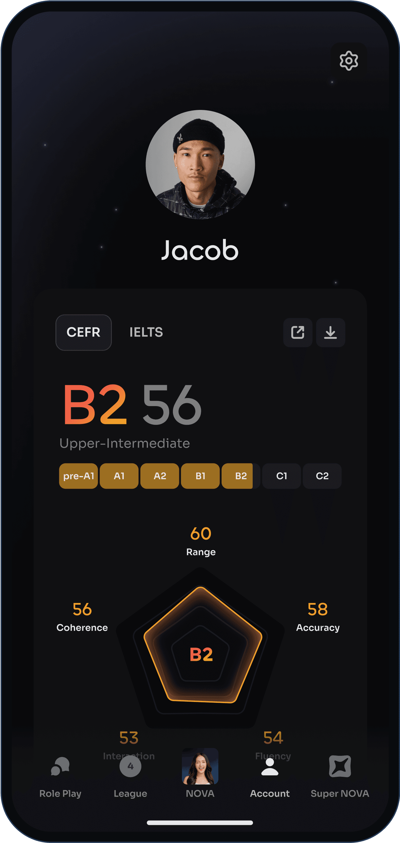
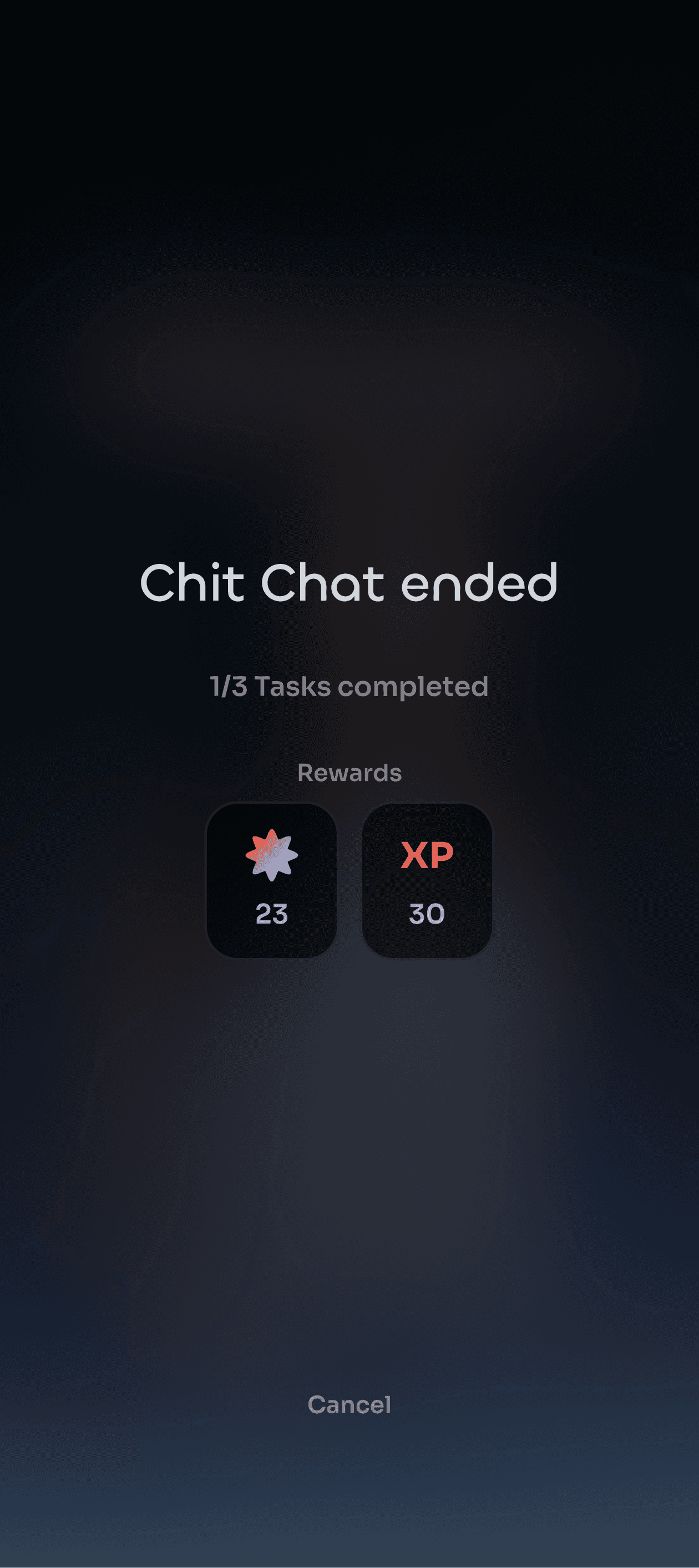
Gamified reward
features

126
Earth
62nd place
180
Day Streak
32
S
M
T
W
T
F
S
160
Small Talk at a Coffee Shop
3
6m
80


Call-to-action
Elements
Language-level
Indicators

Dark Background Levels for
Nova Interface
Lvl -1
Ground
Lvl 1
Lvl 2


Super NOVA
(Premium Plan)
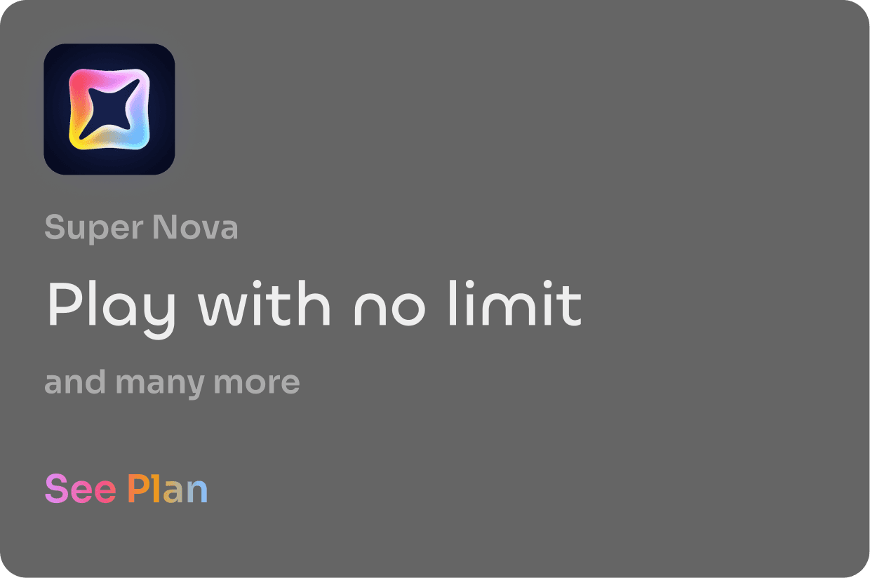
Super NOVA
Super NOVA

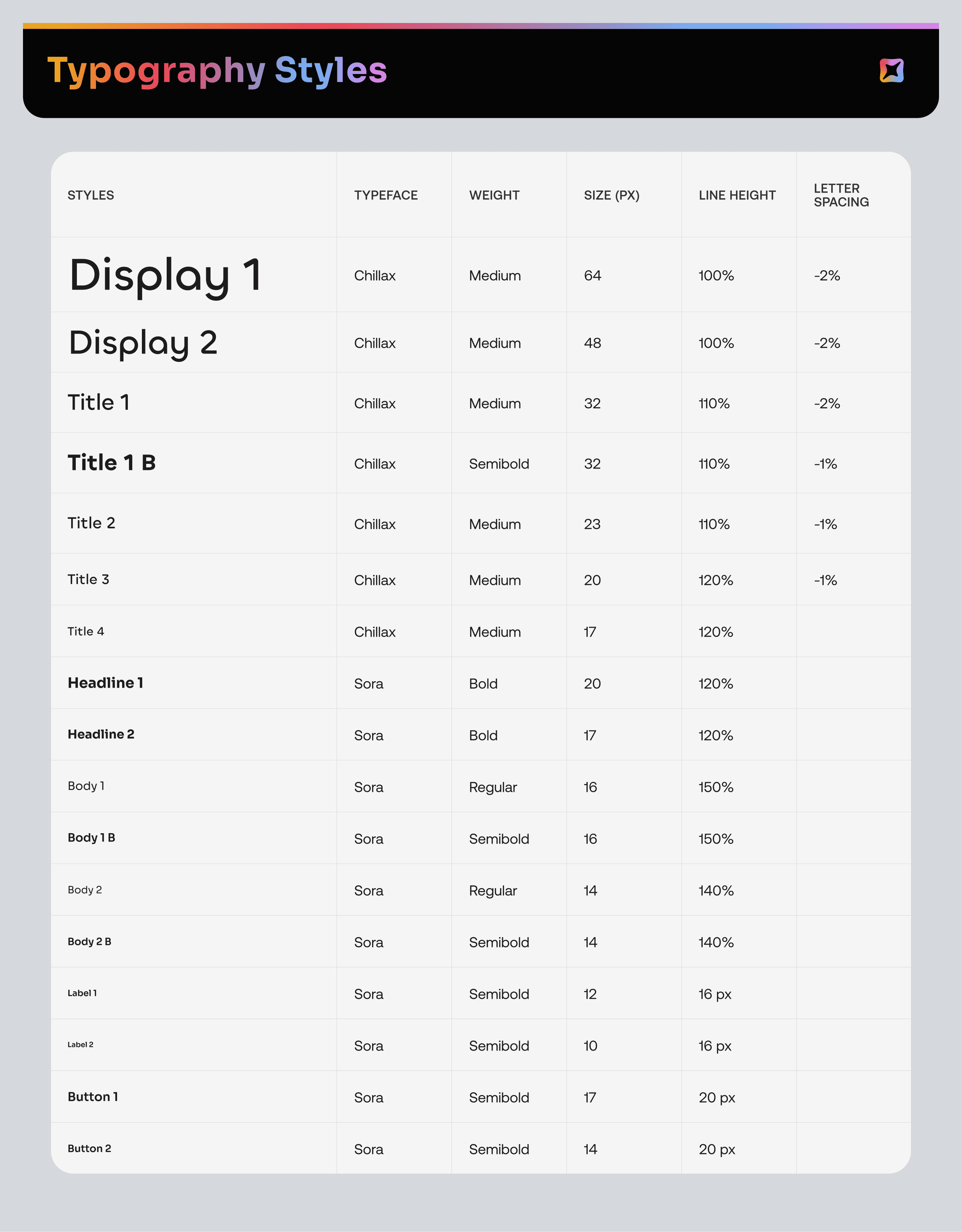
Defined the brand typefaces to capture NOVA identity
C
h
i
l
l
a
x
PRIMARY TYPEFACE
Semibold
Medium
A B C D E F G H I J K L M N O P Q R S T U V W X Y Z A B C D E F G H I J K L M N O P Q R S T U V W X Y Z 1 2 3 4 5 6 7 8 9 0 !@#$%^&*( )_+
With the brand designer, Chillax was introduced as NOVA’s new primary typeface. With its geometric forms and rounded corners, Chillax strikes a balance between futuristic and casual, aligning with NOVA’s advanced yet approachable approach to language learning.
r
S
o
a
SECONDARY TYPEFACE
Bold
SemiBold
Regular
A B C D E F G H I J K L M N O P Q R S T U V W X Y Z A B C D E F G H I J K L M N O P Q R S T U V W X Y Z 1 2 3 4 5 6 7 8 9 0 !@#$%^&*( )_+
Sora was used for body text and buttons for its readable and modern form. Its geometric structure fits seamlessly with NOVA’s space-inspired theme while ensuring clarity in all type sizes.


The result is a highly curated set of UI styles where all visual elements work in harmony.
All while staying true to NOVA’s core design principles.


Highlight 1 of 2
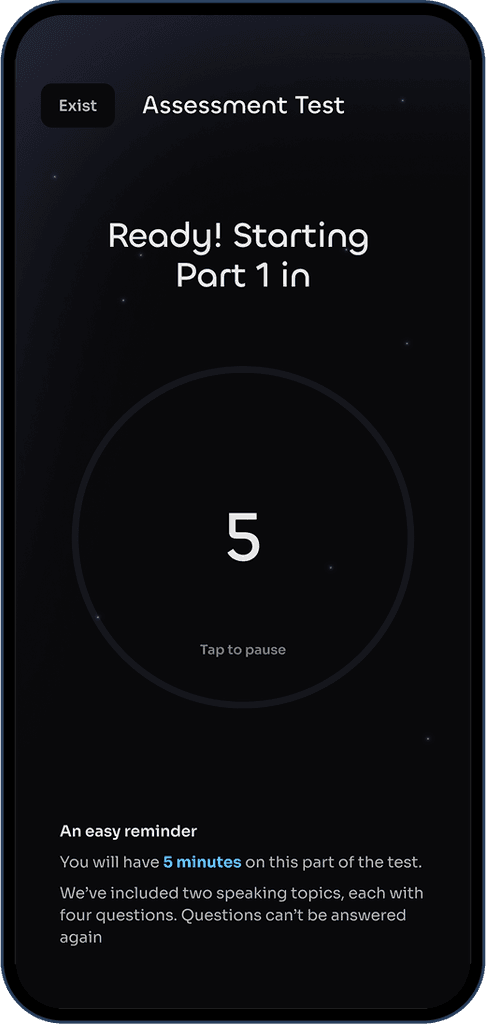
Making speaking exercises more immersive and engaging
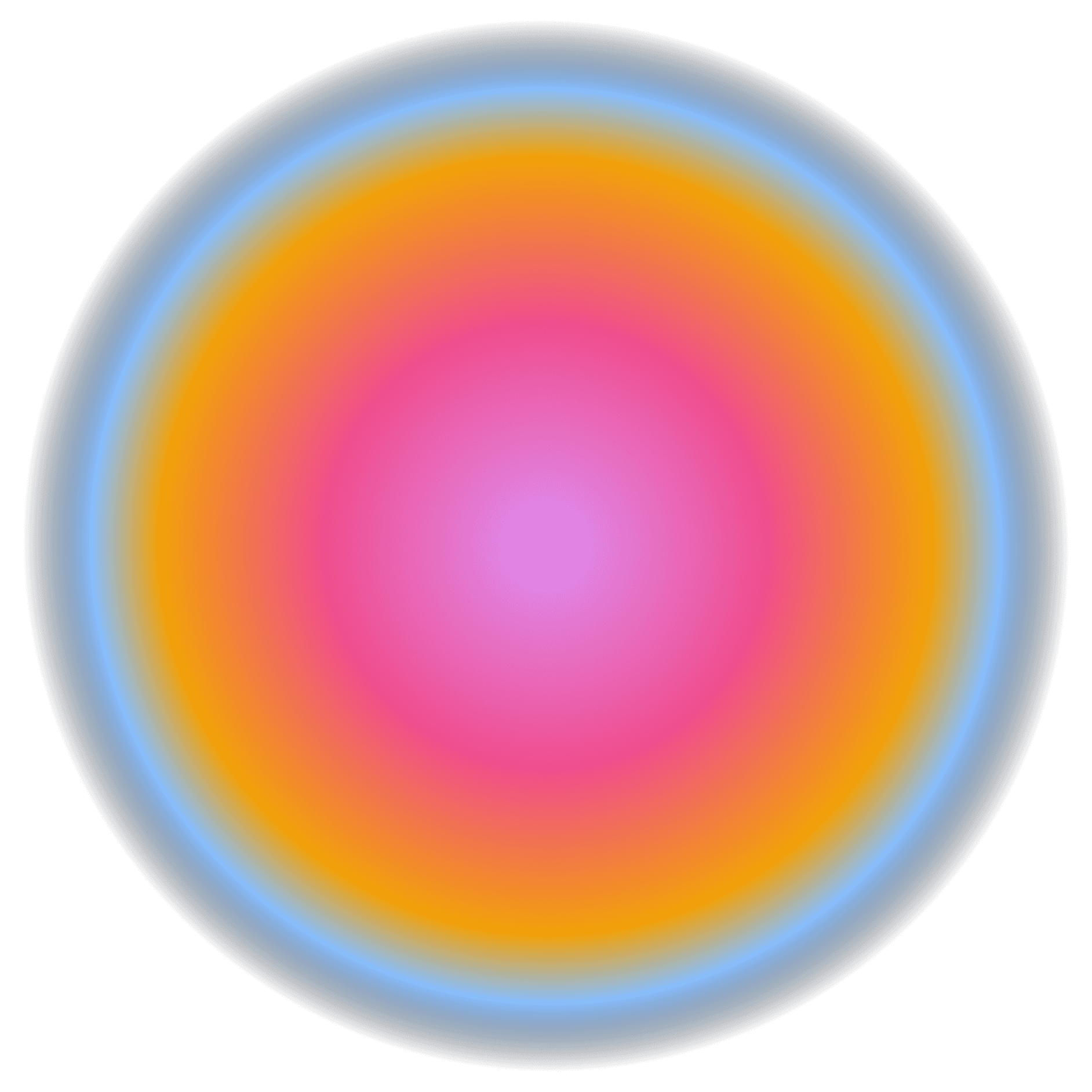
A dynamic stellar background was added during speaking exercises, making users feel more immersed, as if they were speaking in a cosmic space. This visual element enhances engagement by creating a sense of wonder and focus during practice.
Highlight 2 of 2
Using light to differentiate the 'Super NOVA'
Super NOVA is the premium version of NOVA where users can have personalized training. In designing Super NOVA, brightening the NOVA logo simply captures the concept of real life 'super nova' and signals its premium status. This visual cue reinforces the idea of elevated experience and exclusivity.


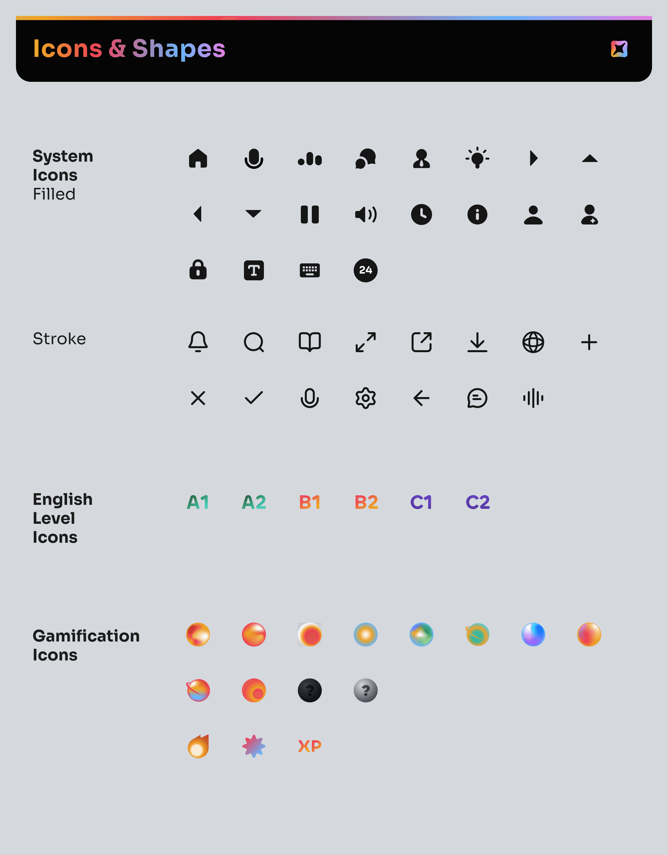
Building a scalable, consistent future with a flexible design system
To maintain visual consistency, accelerate the design process, and support scalability, a comprehensive UI style guide was created early in the project. This included: Tokenized color systems, spacing scales, layout patterns, and brand-aligned graphic assets.

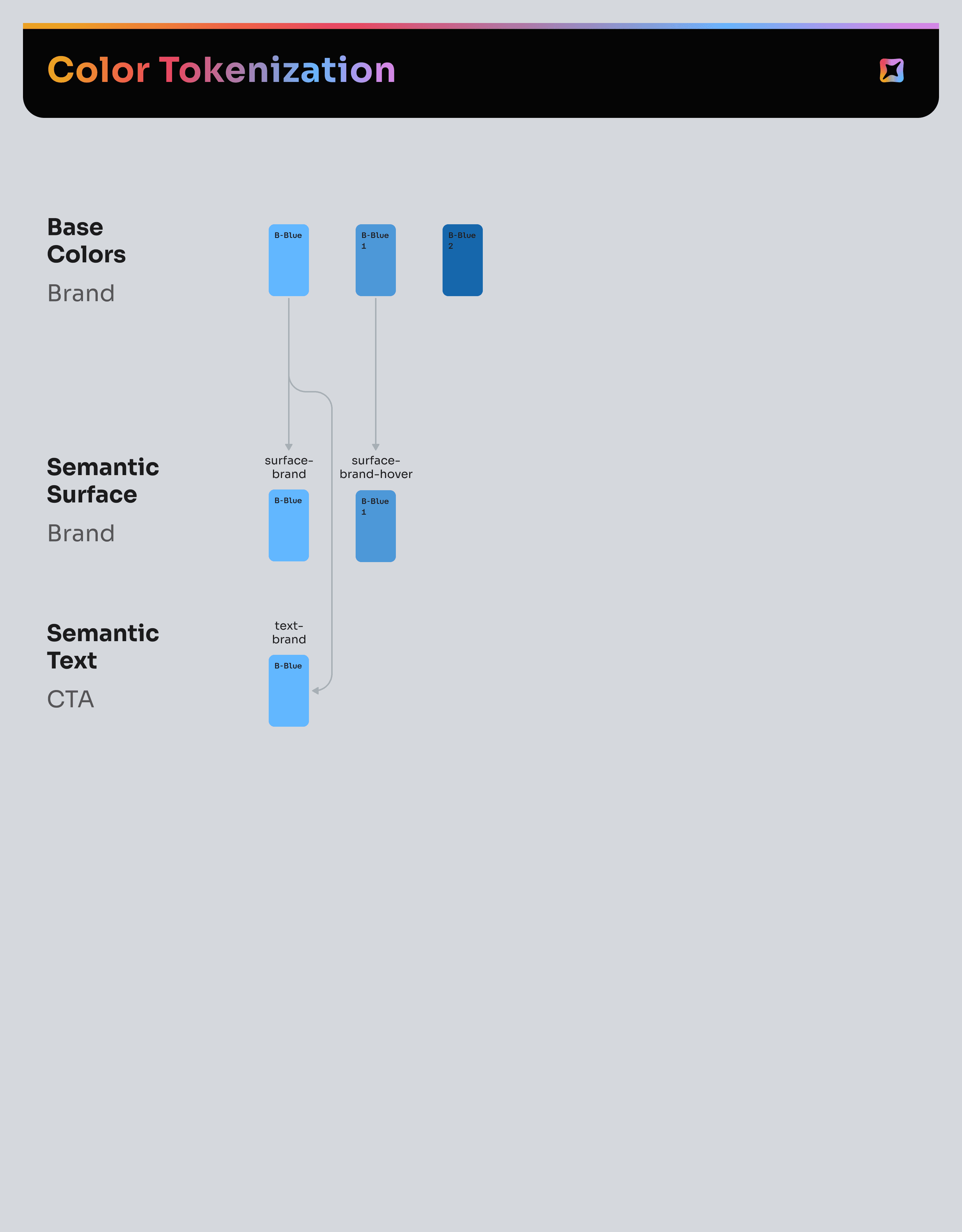
The NOVA interface is built on a two-level color token system. Base tokens define core visual values such as hex codes, spacing, and border radius. Contextual tokens specify where these colors are applied within the interface. Each token is designed to reference another, creating a system where a single visual change can update multiple parts of the interface. This ensures consistency across the design and keeps everything in sync with development.
color-blue
#64B7FF
#62B7FF
color-brand-blue
color-blue
color-text-brand
color-brand-blue
color-surface-brand
color-brand-blue
"/><stop offset="1" stop-color="rgb(36, 128, 110)"/></linearGradient><filter filter-units="objectBoundingBox" height="108.0%" id="g_3KYiu1P-1998767208-shadow-inset" width="105.2%" x="-2.6%" y="-4.0%"><feGaussianBlur in="SourceAlpha" result="g_3KYiu1P-1998767208-shadow-inset-3-blur" stdDeviation="1"/><feOffset dx="1" dy="2" in="g_3KYiu1P-1998767208-shadow-inset-3-blur" result="g_3KYiu1P-1998767208-shadow-inset-3-offset"/><feComposite in="g_3KYiu1P-1998767208-shadow-inset-3-offset" in2="SourceAlpha" k2="-1" k3="1" operator="arithmetic" result="g_3KYiu1P-1998767208-shadow-inset-3-composite"/><feFlood flood-color="rgba(18, 38, 56, 0.25)" result="g_3KYiu1P-1998767208-shadow-inset-3-flood"/><feComposite in="g_3KYiu1P-1998767208-shadow-inset-3-flood" in2="g_3KYiu1P-1998767208-shadow-inset-3-composite" operator="in" result="g_3KYiu1P-1998767208-shadow-inset-3"/><feGaussianBlur in="SourceAlpha" result="g_3KYiu1P-1998767208-shadow-inset-2-blur" stdDeviation="1"/><feOffset dx="1" dy="1" in="g_3KYiu1P-1998767208-shadow-inset-2-blur" result="g_3KYiu1P-1998767208-shadow-inset-2-offset"/><feComposite in="g_3KYiu1P-1998767208-shadow-inset-2-offset" in2="SourceAlpha" k2="-1" k3="1" operator="arithmetic" result="g_3KYiu1P-1998767208-shadow-inset-2-composite"/><feFlood flood-color="rgba(18, 31, 56, 0.45)" result="g_3KYiu1P-1998767208-shadow-inset-2-flood"/><feComposite in="g_3KYiu1P-1998767208-shadow-inset-2-flood" in2="g_3KYiu1P-1998767208-shadow-inset-2-composite" operator="in" result="g_3KYiu1P-1998767208-shadow-inset-2"/><feGaussianBlur in="SourceAlpha" result="g_3KYiu1P-1998767208-shadow-inset-1-blur" stdDeviation="2"/><feOffset dx="-1" dy="-2" in="g_3KYiu1P-1998767208-shadow-inset-1-blur" result="g_3KYiu1P-1998767208-shadow-inset-1-offset"/><feComposite in="g_3KYiu1P-1998767208-shadow-inset-1-offset" in2="SourceAlpha" k2="-1" k3="1" operator="arithmetic" result="g_3KYiu1P-1998767208-shadow-inset-1-composite"/><feFlood flood-color="rgba(175, 227, 205, 0.2)" result="g_3KYiu1P-1998767208-shadow-inset-1-flood"/><feComposite in="g_3KYiu1P-1998767208-shadow-inset-1-flood" in2="g_3KYiu1P-1998767208-shadow-inset-1-composite" operator="in" result="g_3KYiu1P-1998767208-shadow-inset-1"/><feGaussianBlur in="SourceAlpha" result="g_3KYiu1P-1998767208-shadow-inset-0-blur" stdDeviation="1"/><feOffset dx="0" dy="-1" in="g_3KYiu1P-1998767208-shadow-inset-0-blur" result="g_3KYiu1P-1998767208-shadow-inset-0-offset"/><feComposite in="g_3KYiu1P-1998767208-shadow-inset-0-offset" in2="SourceAlpha" k2="-1" k3="1" operator="arithmetic" result="g_3KYiu1P-1998767208-shadow-inset-0-composite"/><feFlood flood-color="rgba(175, 227, 205, 0.35)" result="g_3KYiu1P-1998767208-shadow-inset-0-flood"/><feComposite in="g_3KYiu1P-1998767208-shadow-inset-0-flood" in2="g_3KYiu1P-1998767208-shadow-inset-0-composite" operator="in" result="g_3KYiu1P-1998767208-shadow-inset-0"/><feMerge ><feMergeNode in="g_3KYiu1P-1998767208-shadow-inset-3"/><feMergeNode in="g_3KYiu1P-1998767208-shadow-inset-2"/><feMergeNode in="g_3KYiu1P-1998767208-shadow-inset-1"/><feMergeNode in="g_3KYiu1P-1998767208-shadow-inset-0"/></feMerge></filter><path d="M 125.086 0 C 139.294 0 151.388 2.876 161.368 8.627 C 171.348 14.209 178.96 22.159 184.203 32.477 C 189.616 42.626 192.322 54.551 192.322 68.252 L 192.322 150.458 L 127.877 150.458 L 127.877 77.386 C 127.877 69.267 125.593 63.008 121.026 58.61 C 116.628 54.212 110.369 52.014 102.25 52.014 C 96.499 52.014 91.51 53.197 87.281 55.565 C 83.222 57.764 80.091 61.063 77.893 65.461 C 75.694 69.689 74.595 74.849 74.595 80.938 L 74.595 150.458 L 10.149 150.458 L 10.149 56.834 L 0 4.567 L 64.445 4.567 L 68.957 32.203 C 75.261 22.255 83.455 13.534 93.878 7.865 C 103.519 2.622 113.922 0 125.086 0 Z" id="g_3KYiu1P-1998767208"/></defs><use fill="url(%23g_3KYiu1P-1998767208-linear-gradient)" height="150.458px" href="%23g_3KYiu1P-1998767208" id="g_3KYiu1P" width="192.322px"/><use filter="url(%23g_3KYiu1P-1998767208-shadow-inset)" href="%23g_3KYiu1P-1998767208"/></svg>)
"/><stop offset="1" stop-color="rgb(36, 128, 110)"/></linearGradient><filter filter-units="objectBoundingBox" height="110.4%" id="T1Iaglo5a-2410767398-shadow-inset" width="107.3%" x="-3.6%" y="-5.2%"><feGaussianBlur in="SourceAlpha" result="T1Iaglo5a-2410767398-shadow-inset-3-blur" stdDeviation="3"/><feOffset dx="1" dy="4" in="T1Iaglo5a-2410767398-shadow-inset-3-blur" result="T1Iaglo5a-2410767398-shadow-inset-3-offset"/><feComposite in="T1Iaglo5a-2410767398-shadow-inset-3-offset" in2="SourceAlpha" k2="-1" k3="1" operator="arithmetic" result="T1Iaglo5a-2410767398-shadow-inset-3-composite"/><feFlood flood-color="rgba(11, 15, 43, 0.2)" result="T1Iaglo5a-2410767398-shadow-inset-3-flood"/><feComposite in="T1Iaglo5a-2410767398-shadow-inset-3-flood" in2="T1Iaglo5a-2410767398-shadow-inset-3-composite" operator="in" result="T1Iaglo5a-2410767398-shadow-inset-3"/><feGaussianBlur in="SourceAlpha" result="T1Iaglo5a-2410767398-shadow-inset-2-blur" stdDeviation="1.5"/><feOffset dx="0" dy="1" in="T1Iaglo5a-2410767398-shadow-inset-2-blur" result="T1Iaglo5a-2410767398-shadow-inset-2-offset"/><feComposite in="T1Iaglo5a-2410767398-shadow-inset-2-offset" in2="SourceAlpha" k2="-1" k3="1" operator="arithmetic" result="T1Iaglo5a-2410767398-shadow-inset-2-composite"/><feFlood flood-color="rgba(11, 15, 43, 0.35)" result="T1Iaglo5a-2410767398-shadow-inset-2-flood"/><feComposite in="T1Iaglo5a-2410767398-shadow-inset-2-flood" in2="T1Iaglo5a-2410767398-shadow-inset-2-composite" operator="in" result="T1Iaglo5a-2410767398-shadow-inset-2"/><feGaussianBlur in="SourceAlpha" result="T1Iaglo5a-2410767398-shadow-inset-1-blur" stdDeviation="2"/><feOffset dx="-1" dy="-2" in="T1Iaglo5a-2410767398-shadow-inset-1-blur" result="T1Iaglo5a-2410767398-shadow-inset-1-offset"/><feComposite in="T1Iaglo5a-2410767398-shadow-inset-1-offset" in2="SourceAlpha" k2="-1" k3="1" operator="arithmetic" result="T1Iaglo5a-2410767398-shadow-inset-1-composite"/><feFlood flood-color="rgba(139, 224, 178, 0.2)" result="T1Iaglo5a-2410767398-shadow-inset-1-flood"/><feComposite in="T1Iaglo5a-2410767398-shadow-inset-1-flood" in2="T1Iaglo5a-2410767398-shadow-inset-1-composite" operator="in" result="T1Iaglo5a-2410767398-shadow-inset-1"/><feGaussianBlur in="SourceAlpha" result="T1Iaglo5a-2410767398-shadow-inset-0-blur" stdDeviation="1"/><feOffset dx="0" dy="-1" in="T1Iaglo5a-2410767398-shadow-inset-0-blur" result="T1Iaglo5a-2410767398-shadow-inset-0-offset"/><feComposite in="T1Iaglo5a-2410767398-shadow-inset-0-offset" in2="SourceAlpha" k2="-1" k3="1" operator="arithmetic" result="T1Iaglo5a-2410767398-shadow-inset-0-composite"/><feFlood flood-color="rgba(139, 224, 178, 0.35)" result="T1Iaglo5a-2410767398-shadow-inset-0-flood"/><feComposite in="T1Iaglo5a-2410767398-shadow-inset-0-flood" in2="T1Iaglo5a-2410767398-shadow-inset-0-composite" operator="in" result="T1Iaglo5a-2410767398-shadow-inset-0"/><feMerge ><feMergeNode in="T1Iaglo5a-2410767398-shadow-inset-3"/><feMergeNode in="T1Iaglo5a-2410767398-shadow-inset-2"/><feMergeNode in="T1Iaglo5a-2410767398-shadow-inset-1"/><feMergeNode in="T1Iaglo5a-2410767398-shadow-inset-0"/></feMerge></filter><path d="M 121.026 0 C 135.404 0 147.921 3.214 158.577 9.642 C 169.233 16.069 177.522 25.119 183.442 36.79 C 189.532 48.461 192.576 62.078 192.576 77.64 C 192.576 93.032 189.532 106.564 183.442 118.235 C 177.522 129.907 169.234 138.956 158.577 145.384 C 147.921 151.811 135.404 155.025 121.026 155.025 C 107.156 155.025 94.808 151.811 83.982 145.384 C 76.457 140.845 69.946 135.038 64.445 127.969 L 64.445 192.322 L 0 192.322 L 0 4.567 L 64.445 4.567 L 64.445 26.818 C 70.043 19.76 76.639 14.034 84.236 9.642 C 95.062 3.214 107.325 0 121.026 0 Z M 100.221 48.461 C 94.639 48.461 89.226 49.729 83.982 52.267 C 78.739 54.804 74.172 58.272 70.281 62.67 C 66.391 67.068 63.6 72.058 61.908 77.64 C 63.6 83.221 66.391 88.212 70.281 92.609 C 74.172 96.838 78.739 100.221 83.982 102.758 C 89.226 105.295 94.639 106.563 100.221 106.563 C 105.633 106.563 110.369 105.295 114.429 102.758 C 118.657 100.221 121.871 96.838 124.07 92.609 C 126.438 88.212 127.623 83.221 127.623 77.64 C 127.623 72.058 126.438 67.068 124.07 62.67 C 121.871 58.272 118.657 54.804 114.429 52.267 C 110.369 49.73 105.633 48.461 100.221 48.461 Z" id="T1Iaglo5a-2410767398"/></defs><use fill="url(%23T1Iaglo5a-2410767398-linear-gradient)" height="192.322px" href="%23T1Iaglo5a-2410767398" id="T1Iaglo5a" width="192.576px"/><use filter="url(%23T1Iaglo5a-2410767398-shadow-inset)" href="%23T1Iaglo5a-2410767398"/></svg>)
"/><stop offset="1" stop-color="rgb(36, 128, 110)"/></linearGradient><filter filter-units="objectBoundingBox" height="109.0%" id="erQrIfrFl-4282174914-shadow-inset" width="105.1%" x="-2.6%" y="-4.5%"><feGaussianBlur in="SourceAlpha" result="erQrIfrFl-4282174914-shadow-inset-3-blur" stdDeviation="1.975"/><feOffset dx="0.99" dy="2.96" in="erQrIfrFl-4282174914-shadow-inset-3-blur" result="erQrIfrFl-4282174914-shadow-inset-3-offset"/><feComposite in="erQrIfrFl-4282174914-shadow-inset-3-offset" in2="SourceAlpha" k2="-1" k3="1" operator="arithmetic" result="erQrIfrFl-4282174914-shadow-inset-3-composite"/><feFlood flood-color="rgba(18, 31, 56, 0.2)" result="erQrIfrFl-4282174914-shadow-inset-3-flood"/><feComposite in="erQrIfrFl-4282174914-shadow-inset-3-flood" in2="erQrIfrFl-4282174914-shadow-inset-3-composite" operator="in" result="erQrIfrFl-4282174914-shadow-inset-3"/><feGaussianBlur in="SourceAlpha" result="erQrIfrFl-4282174914-shadow-inset-2-blur" stdDeviation="1.48"/><feOffset dx="0" dy="0.99" in="erQrIfrFl-4282174914-shadow-inset-2-blur" result="erQrIfrFl-4282174914-shadow-inset-2-offset"/><feComposite in="erQrIfrFl-4282174914-shadow-inset-2-offset" in2="SourceAlpha" k2="-1" k3="1" operator="arithmetic" result="erQrIfrFl-4282174914-shadow-inset-2-composite"/><feFlood flood-color="rgba(18, 31, 56, 0.35)" result="erQrIfrFl-4282174914-shadow-inset-2-flood"/><feComposite in="erQrIfrFl-4282174914-shadow-inset-2-flood" in2="erQrIfrFl-4282174914-shadow-inset-2-composite" operator="in" result="erQrIfrFl-4282174914-shadow-inset-2"/><feGaussianBlur in="SourceAlpha" result="erQrIfrFl-4282174914-shadow-inset-1-blur" stdDeviation="1.975"/><feOffset dx="-0.99" dy="-1.98" in="erQrIfrFl-4282174914-shadow-inset-1-blur" result="erQrIfrFl-4282174914-shadow-inset-1-offset"/><feComposite in="erQrIfrFl-4282174914-shadow-inset-1-offset" in2="SourceAlpha" k2="-1" k3="1" operator="arithmetic" result="erQrIfrFl-4282174914-shadow-inset-1-composite"/><feFlood flood-color="rgba(156, 230, 192, 0.2)" result="erQrIfrFl-4282174914-shadow-inset-1-flood"/><feComposite in="erQrIfrFl-4282174914-shadow-inset-1-flood" in2="erQrIfrFl-4282174914-shadow-inset-1-composite" operator="in" result="erQrIfrFl-4282174914-shadow-inset-1"/><feGaussianBlur in="SourceAlpha" result="erQrIfrFl-4282174914-shadow-inset-0-blur" stdDeviation="0.99"/><feOffset dx="0" dy="-0.99" in="erQrIfrFl-4282174914-shadow-inset-0-blur" result="erQrIfrFl-4282174914-shadow-inset-0-offset"/><feComposite in="erQrIfrFl-4282174914-shadow-inset-0-offset" in2="SourceAlpha" k2="-1" k3="1" operator="arithmetic" result="erQrIfrFl-4282174914-shadow-inset-0-composite"/><feFlood flood-color="rgba(156, 230, 192, 0.35)" result="erQrIfrFl-4282174914-shadow-inset-0-flood"/><feComposite in="erQrIfrFl-4282174914-shadow-inset-0-flood" in2="erQrIfrFl-4282174914-shadow-inset-0-composite" operator="in" result="erQrIfrFl-4282174914-shadow-inset-0"/><feMerge ><feMergeNode in="erQrIfrFl-4282174914-shadow-inset-3"/><feMergeNode in="erQrIfrFl-4282174914-shadow-inset-2"/><feMergeNode in="erQrIfrFl-4282174914-shadow-inset-1"/><feMergeNode in="erQrIfrFl-4282174914-shadow-inset-0"/></feMerge></filter><path d="M 96.622 0 C 96.787 0 97.357 0 97.724 0 C 116.78 0 133.411 3.176 147.619 9.528 C 161.993 15.879 173.109 24.822 180.965 36.355 C 188.988 47.888 193 61.343 193 76.721 C 193 91.931 188.988 105.303 180.965 116.836 C 173.109 128.369 161.993 137.312 147.619 143.664 C 133.411 150.015 116.78 153.191 97.724 153.191 C 78.669 153.191 61.954 150.015 47.579 143.664 C 33.372 137.312 22.256 128.369 14.233 116.836 C 6.377 105.303 2.449 91.931 2.449 76.721 C 2.449 61.343 6.377 47.888 14.233 36.355 C 15.375 34.714 16.582 33.126 17.849 31.59 L 0 31.59 C 24.077 12.692 56.752 0 96.622 0 Z M 97.724 46.384 C 91.206 46.384 85.606 47.553 80.926 49.893 C 76.246 52.233 72.652 55.661 70.145 60.174 C 67.805 64.687 66.634 70.119 66.634 76.471 C 66.635 82.99 67.805 88.505 70.145 93.018 C 72.652 97.531 76.246 100.957 80.926 103.297 C 85.607 105.637 91.206 106.808 97.724 106.808 C 104.41 106.808 110.01 105.637 114.523 103.297 C 119.203 100.957 122.714 97.531 125.054 93.018 C 127.561 88.505 128.814 83.072 128.814 76.721 C 128.814 70.202 127.561 64.687 125.054 60.174 C 122.714 55.661 119.203 52.233 114.523 49.893 C 110.01 47.553 104.41 46.384 97.724 46.384 Z" id="erQrIfrFl-4282174914"/></defs><use fill="url(%23erQrIfrFl-4282174914-linear-gradient)" height="153.19135391610217px" href="%23erQrIfrFl-4282174914" id="erQrIfrFl" width="193px"/><use filter="url(%23erQrIfrFl-4282174914-shadow-inset)" href="%23erQrIfrFl-4282174914"/></svg>)